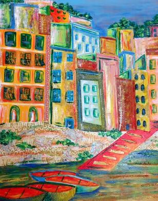
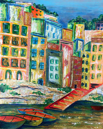
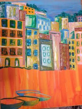
During my trip to Europe, I visited the cutest, most colorful town I have ever been to in my entire life. The pictures that I googled before visiting do not even compare to the vividness and fantasy-like quality of Cinque Terre. So naturally, while I was there, I took TONS of pictures. I was just so inspired and knew I wanted to capture it somehow on canvas. However, I have been kind of avoiding doing it for my concentration because I knew it would take forever as all of the photos are so detailed oriented. I decided to go for it and I couldn't be more glad that I did as I think it may be my strongest piece yet. I chose the following photo because I loved the off centered composition.
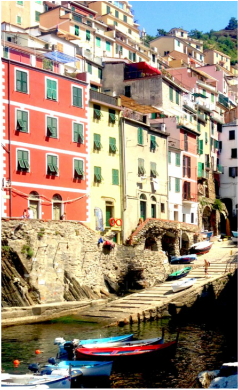
I knew that I really wanted to play up the bright color scheme as that is my favorite thing about the town. I chose to focus on salmons, bright blues, lime greens, and yellows. Beyond color scheme, though, I really had no plan at all about how I was going to carry out this piece. I started by simply layering a bunch of different fabrics and patterned papers in the general shapes of the buildings. I kept going over and over again along with acrylic paints to create lots of texture. The photo has so much depth and I definitely wanted to recreate that in my piece. It was challenging however, because I was also drawn to the abstract style. I decided to meet somewhere in the middle and make the buildings that are further back a little duller. I also brought some brighter values to the buildings in the foreground and made them more detailed as well. I am really starting to get the hang of figuring out how to play around with the composition using different media.
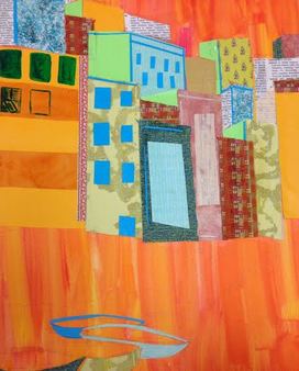
I thought I was finished but then I decided that the rocks in the foreground needed to pop a little more because they were pretty bland compared to the brightness of the background and I thought it was pretty confusing. I actually found some maps that I brought home from Cinque Terre and was able to incorporate those as well. Finally, to bring the colors full circle, I added some greenery to the top of the buildings as well as the front brick wall. I really think that your eye is able to travel well throughout the page now and it looks likes one cohesive piece.
I am so in love with the brightness of this piece and the happiness that it brings. I am automatically transported right back to being in Cinque Terre and all the feelings I had while I was there. That is my hope for others as well and from the response I have gotten so far, everyone loves the happy quality. I love the child like quality of my concentration and honestly not planning everything out and having fun with my pieces has made my portfolio so much stronger. I can't wait for the next one!