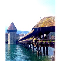
For my second concentration piece, I chose a photo of something much more recognizable and iconic than the last piece: Kappellbrucke bridge in Lucerne, Switzerland. The bridge has great lines which I thought would make for a really interesting piece. I loved the colors as well and knew that I could really enhance those when I recreated it. Lucerne has a really clean, cool atmosphere with a lot of historic qualities. Everything in the town seemed like it had a story behind it and I really wanted to capture that in my piece.
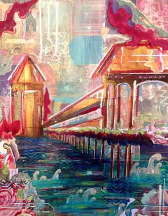
| I began with a light turquoise wash and then created almost a quilt-like pattern with various papers in the blue and magenta color scheme I was aiming for. I then sketched out a large version of just the bridge and used acrylic paint to fill in the spaces, not creating much value or anything, just basic color. Then began all of the layer work that I had become all too familiar with, working with the last piece. I knew that I had to put as many layers in as possible to create a natural texture that would work really well in the piece. | 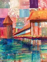 |
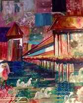 | I ran into some problems when I had layered so many various fabrics and papers that distracted from the main focal point of the bridge. The colors kind of blended all of it together and it definitely did not pop as much as I had hoped for. I went in with a white paint pen and outlined the bridge in certain places, repeating it other places as well, to make it stand out from the quilt work behind. I was careful to repeat other elements throughout as well to make sure it looked like one unified piece such as the horizontal lines, geometric shapes, watercolor splotches, magenta fabric, and more. |
I think this piece really taught me that with mixed media, you really can't make mistakes. You just have to keep layering until the composition looks right. It is always hard to determine when I am finished with a mixed media piece because I feel like there is so much I could still do to it. I really just have to trust my instinct and stop when I am happy with the final product which I definitely am with this one. I absolutely love the color scheme. I also think that the juxtaposition of the geometric shapes and the more fluid shapes works really well. I can already see improvement from the first in my concentration and am looking forward to the next one.