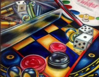
I am extremely happy with how this piece turned out. As explained in my previous post, I was really inspired by the photo I took and the concept of my inner child that I came up with. I think the joy that this subject matter held for me really effected the final piece as I was excited to work on it everyday and apply new skills.
I have worked with prismacolors multiple times before but I have always played it some what safe in my application of them. I have always done simple objects or stuck to the same color scheme. I really wanted to try something completely different with this project and I think it paid off. The aspect that I think works the best in this piece is the color saturation. I layered each color multiple times to get the deep blended effect, making it almost look like a painting. I also used unexpected colors to make more of an impact such as applying purples and light blues on to the black checkerboard boxes. This was extremely challenging for me because all of my instincts were telling me to pick up the black colored pencil. I am happy to report that my black pencil is still very large (not full size- I did cheat a little). I am glad that I chose this color scheme as well because I think it adds to the overall theme and feeling of the piece which is very playful. Not only do the drawings of game pieces make it playful, but the lively colors make it all feel whimsical as well.
Reflections can be very intimidating. I am used to doing reflections in glasses or with water that makes the image perfectly clear. This piece was especially intimidating because the reflections are not as clear. The checkerboard featured is actually made out of reflective tin, but the colors dull the reflections a lot. Certain objects could be seen more clearly than others such as the dice. Another area that was difficult was the side of the tin canister. The side of the tin showed reflective properties, but was not very clear. The colors were dull and not as vibrant which was very hard to replicate with the pencils. Overall, however, I think that the reflections come across really well, just in a not as obvious way.
