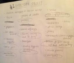
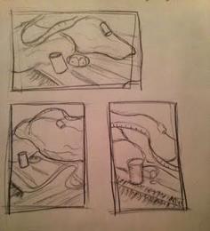
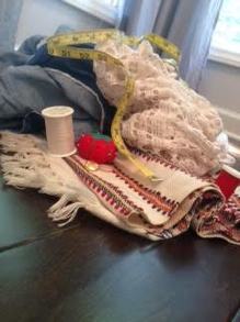
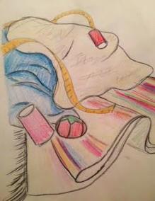
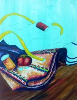
For our second project, we were assigned our first painting. The painting had to be of an everyday object but was also thinking a little outside the box. I knew that this painting would be a great opportunity to create a quality still life for my AP portfolio because still life paintings are great chances to show attention to detail and other elements of art. However, I struggled to come up with ideas more than I thought I would. I took TONS of pictures and by tons, I mean over 200. I tried thinking creatively but none of my ideas were getting me excited to start painting. Then one afternoon, I was in an antique shop wandering around when I noticed this really interesting tapestry. I took a couple pictures of it and when I looked back at them, I loved how you could see the grain of the fabric. The picture wasn't detailed enough to paint, but I arranged some of my own fabrics from home as well as some sewing supplies and came up with a composition that I was really inspired by. So I did a few sketches, mapped out my color scheme, and started painting! I am about halfway finished but I am really looking forward to seeing how it turns out. Oil paints are one of my favorite mediums and I am loving getting back into them.
I am extremely happy with how this piece turned out. As explained in my previous post, I was really inspired by the photo I took and the concept of my inner child that I came up with. I think the joy that this subject matter held for me really effected the final piece as I was excited to work on it everyday and apply new skills.
I have worked with prismacolors multiple times before but I have always played it some what safe in my application of them. I have always done simple objects or stuck to the same color scheme. I really wanted to try something completely different with this project and I think it paid off. The aspect that I think works the best in this piece is the color saturation. I layered each color multiple times to get the deep blended effect, making it almost look like a painting. I also used unexpected colors to make more of an impact such as applying purples and light blues on to the black checkerboard boxes. This was extremely challenging for me because all of my instincts were telling me to pick up the black colored pencil. I am happy to report that my black pencil is still very large (not full size- I did cheat a little). I am glad that I chose this color scheme as well because I think it adds to the overall theme and feeling of the piece which is very playful. Not only do the drawings of game pieces make it playful, but the lively colors make it all feel whimsical as well. Reflections can be very intimidating. I am used to doing reflections in glasses or with water that makes the image perfectly clear. This piece was especially intimidating because the reflections are not as clear. The checkerboard featured is actually made out of reflective tin, but the colors dull the reflections a lot. Certain objects could be seen more clearly than others such as the dice. Another area that was difficult was the side of the tin canister. The side of the tin showed reflective properties, but was not very clear. The colors were dull and not as vibrant which was very hard to replicate with the pencils. Overall, however, I think that the reflections come across really well, just in a not as obvious way. |