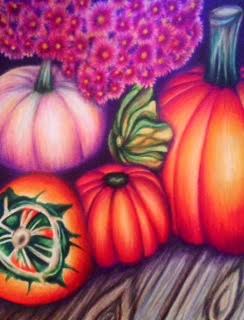
Every month, the Colored Pencil Magazine puts out a photograph for the month of which they ask readers to recreate using colored pencils. This month's picture was a fall scene with various warm colors. It is a very intimidating picture and I felt weird about getting inspired by someone else's photo but I was excited to have a chance to just practice my technique with Prismacolors and apply my style to something that was not originally inspiring to me.
I ended up having a lot of fun with this project. Like I said, I felt weird about using someone else's inspiration but I definitely was able to try some different techniques on this piece that I haven't tried before and find ways to place in my own style. I decided to crop the photo so I could spend all of my time and attention on a more specific area. That definitely worked towards my benefit as I achieved a lot of detail I wouldn't have otherwise and it makes my piece unique. This assignment was great practice for different layering techniques and achieving so much value. I found a deep color Prismacolor called "black grape" and was able to use it for the shadows since I hate using black. It added some warmth to the piece that straight black wouldn't have which was good since I wanted a very warm feel to come from the drawing. I am glad I added in so much purple that was not seen in the original photo because it really allows my aesthetic to show in the piece, which is using bright colors. I was hesitant to put in the green as I wanted to stick with the warm scheme and contemplated putting in browns and reds instead, but I am glad I stuck with the green. I was able to add some yellow and orange to it to warm it up more. I think placing it in more than just the one obvious spot on the bottom left corner ties the whole piece together. The wood challenged me as well because the colors found in it in the original photo did not flow with my color scheme either. Again, I added in some of the colors I had used much of before and it tied together nicely. Overall I am very happy with this piece because it does not look like a replica of the photo but rather something straight out of my portfolio. It definitely has my style and I am thankful for the opportunity to practice applying that style to various things!
I ended up having a lot of fun with this project. Like I said, I felt weird about using someone else's inspiration but I definitely was able to try some different techniques on this piece that I haven't tried before and find ways to place in my own style. I decided to crop the photo so I could spend all of my time and attention on a more specific area. That definitely worked towards my benefit as I achieved a lot of detail I wouldn't have otherwise and it makes my piece unique. This assignment was great practice for different layering techniques and achieving so much value. I found a deep color Prismacolor called "black grape" and was able to use it for the shadows since I hate using black. It added some warmth to the piece that straight black wouldn't have which was good since I wanted a very warm feel to come from the drawing. I am glad I added in so much purple that was not seen in the original photo because it really allows my aesthetic to show in the piece, which is using bright colors. I was hesitant to put in the green as I wanted to stick with the warm scheme and contemplated putting in browns and reds instead, but I am glad I stuck with the green. I was able to add some yellow and orange to it to warm it up more. I think placing it in more than just the one obvious spot on the bottom left corner ties the whole piece together. The wood challenged me as well because the colors found in it in the original photo did not flow with my color scheme either. Again, I added in some of the colors I had used much of before and it tied together nicely. Overall I am very happy with this piece because it does not look like a replica of the photo but rather something straight out of my portfolio. It definitely has my style and I am thankful for the opportunity to practice applying that style to various things!