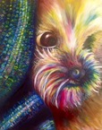
I was very excited about the chance to create another pet portrait. Last year when I completed my pet portrait, I used oil paints and it was one of the first paintings I did that I was really proud of, mostly due to the fact that it was also the time that I really started coming into my style of using various colors. I really enjoyed the assignment this year and was excited to try my hand at it again, this time, using Prismacolor pencils. Last year's piece is to the right.
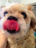
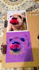
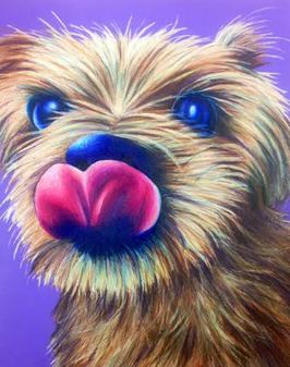
I knew that it would be a challenge because I got used to a very painterly quality in the last portrait. With Prismacolors, I knew I would have to get much more detail and be more precise. I have improved my skills with Prismacolors over the course of the semester and was anxious to put them to test. I took lots of pictures of my dog and he wouldn't stay still for any of them. Finally, I got this photo which is slightly blurry, but I think it really shows his personality, especially with the tongue sticking out. The photo is very charismatic and I knew I wanted the drawing to match that energy.
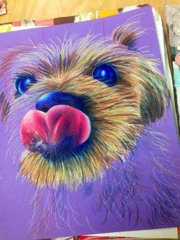
At first, I thought I wanted this portrait more realistic than the last one, using more browns and tans and not all the colors. I couldn't help myself, however, and started putting in a little blue, then some purple, and it just went off from there. It was definitely a challenging piece, as it required so many layers of color to create the look of the fur. When I was in the beginning stages, I thought the fur looked too wirey and not fluffy enough. More layers though really helped and he gradually came into shape more. The dark values were also an issue because I also try to refrain from using black. The dark indigo pencil just was not dark enough against the browns in the fur, but I found a very dark purple color that flowed really nicely with the piece and created a nice contrast. Making the tongue and nose look shiny was also stressful as I did not think that my highlights were strong enough. Adding in lots of white and blending it in ending up working out very well and I think it has a realistic effect. I definitely got into a rhythm the more I worked on the piece.
I am really happy with how the piece came out. I think the textural qualities and the color scheme work really nicely together. I have not worked with created texture that much so it was a neat experience. I think I have improved significantly since last year and it is very encouraging to see the fruition of hard work.
I am really happy with how the piece came out. I think the textural qualities and the color scheme work really nicely together. I have not worked with created texture that much so it was a neat experience. I think I have improved significantly since last year and it is very encouraging to see the fruition of hard work.
 |  |
